


80% of traffic dropped off the quotes page before selecting a plan. Here's how we redesigned the experience to change that.


Company:
PolicyMe
Role:
Senior Product Designer
Year:
2025 - 2026
Context
Buying insurance in Canada has traditionally involved a lot of phone calls and PDFs. PolicyMe was built to rethink that experience by making insurance simpler to understand and easier to buy online—while still giving customers access to licensed advisors when they need them.
I joined PolicyMe while the team was working to improve the digital experience for Health & Dental insurance. I was tasked with improving conversion rate at the quotes page, by getting more people to move from getting a quote to choosing a plan.
My product manager and I led the data analysis, research, UX, interaction design, design sprints, prototyping and usability testing that could diagnose the problem and present solutions to drive conversion.

Fig 01: The original quotes page on desktop and mobile.
The Problem
80% of users dropped off on the quotes page, and we didn’t know why. We had a long list of hypotheses as to what the reason for this could be, and no shortage of ideas for what might fix them, but none were validated through research.
-
Were customers struggling to find the plan they wanted?
-
Were there simply too many options?
-
Was the cost of the plans causing people to leave?
-
Were people leaving because they wanted to compare PolicyMe with another provider?
-
Or were some customers simply not ready to buy yet?
Before building anything, it was important to get actual evidence and data.
Approach
We combined product data, advisor feedback, usability testing, and customer interviews to understand both where people were dropping off and why. This helped us separate product problems we could solve from reasons people might leave regardless of the experience.
12+
Months of data
analysed
50+
Interviews conducted
5
Usability
tests ran
35+
Advisor calls screened

Fig 02: Annotated quotes page with problems the research surfaced.
What the data & people told us
We combined product data, advisor feedback, usability testing, and customer interviews to understand both where people were dropping off and why. This helped us separate product problems we could solve from reasons people might leave regardless of the experience.
ANALYTICS
70% of quote traffic was mobile. This made improving the mobile experience an obvious priority.
ADVISOR FEEDBACK
Customers weren't always discovering all of their plan options. Advisors regularly heard from customers who didn't realise they could access additional plans through the tabs and arrows.
USABILITY TESTING
Customers also struggled to compare plans even after finding them. Testing showed that the way benefits were presented made it difficult to understand the differences between plans.
CUSTOMER INTERVIEWS
Customers weren't all approaching insurance with the same level of intent or confidence.
- Different timelines: Some customers were ready to purchase, while others, particularly older customers, started researching 6–12 months before they expected to need coverage.
- Too much to process: Customers felt overwhelmed by the number of plans and the amount of information they were expected to work through.
-
Uncertainty about the “right” plan: Even when customers understood their options, many weren't sure whether the plan they had chosen was actually the best fit for them.
What was out of scope & why it matters
Some customers were leaving for reasons we couldn't (or shouldn't) solve through the quote experience: plan cost, people looking for a specific benefit that we did not provide, people comparing PolicyMe against other providers before buying.
We kept these behaviours in mind, but focused the redesign on the friction we could actually address: helping customers discover, understand, compare, and feel confident about their options.
Solution
We needed to make the experience:
-
Simpler without hiding important information.
-
Personalised for the priority needs of customers.
-
Helpful without taking away customer choice.
-
Distill Confidence in the plan selected without pretending there was one universally correct/ “popular” plan.
So rather than simply redesigning the existing plan cards, we explored a different question:
What if PolicyMe helped customers choose, instead of simply showing them everything they could choose from?
Our solution therefore focused on 4 key themes:
START WITH A RECOMMENDATION
The existing experience presented customers with up to 10 different plans, with filters and toggles allowing them to narrow the options. That gave customers control, but it also meant they had to do the work of figuring out which plans were relevant.
Instead of immediately presenting every option, we explored a recommendation-led experience that surfaced one strong recommendation first, without removing the autonomy of choice by still allowing customers to compare alternatives.

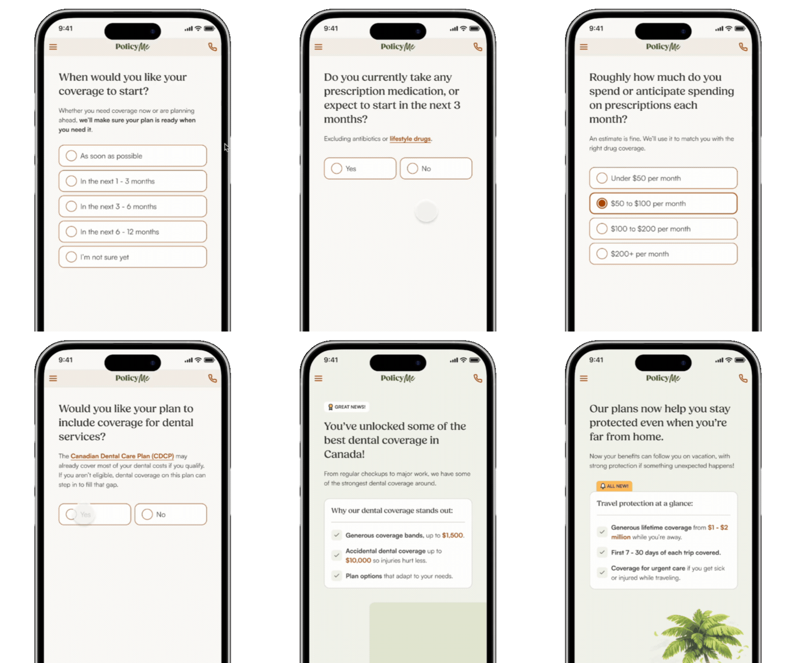
TRIAGE: TURN CUSTOMER NEEDS INTO A RECOMMENDATION
To make recommendations useful, we needed to understand that customers weren't all shopping for insurance in the same way.
The existing experience essentially gave everyone the same set of options. We explored a recommendation triage experience that used customer needs to narrow down the most relevant plans.
KEEP THE FLEXIBILITY OF CHOICE, BUT MAKE IT EASIER TO COMPARE
One of the clearest usability problems in the existing experience was that customers struggled to understand how plans differed.
So rather than forcing people to jump between individual plan cards, I explored a dedicated two-plan comparison experience.
This made the differences between plans explicit rather than requiring customers to remember information from one card while reading another.

GIVE PEOPLE THE INFORMATION THEY NEED, WHEN THEY NEED IT
Collapsible sections
We explored ways to make information available when customers needed it, rather than presenting everything at once.
That meant:
-
Collapsible benefit sections
-
Giving priority to the most important benefits
-
Allowing customers to expand sections when they wanted more detail
This helped us balance two competing needs:
“Just tell me what I need to know.” and
“I want to understand exactly what I'm getting.”
Educational screens
The research also showed that uncertainty was a significant part of the decision.
If customers weren't confident in their own ability to choose a plan, simply giving them more information wasn't necessarily going to solve the problem.
So the recommendation experience was paired with educational transition screens that highlighted benefits that were particularly relevant to customers and differentiated PolicyMe's coverage from alternatives in the market.

The resulting experience
We combined product data, advisor feedback, usability testing, and customer interviews to understand both where people were dropping off and why. This helped us separate product problems we could solve from reasons people might leave regardless of the experience.
01.
Understand the customer
Identify what matters to them.
02.
Recommend a plan
Give them a strong starting point.
03.
Explain why
Build confidence in the recommendation.
04.
Compare if needed
Let customers explore alternatives without overwhelming them.
05.
Choose with confidence
Give customers control over the final decision.


Impact
While the redesign was yet to be launched before I left PolicyMe, we validated the direction through 2 follow-up usability tests.
Across two rounds of follow-up usability testing, 75%+ of participants across internal and external testing and addressed the key issues identified in our research. Stakeholders signed off on an A/B incremental rollout before I left."